Prgram used: 3Ds Max 2008
Plane modelling.
The Petite Animator
Monday, November 1, 2010
Tuesday, October 26, 2010
How to: Story Boards
Storyboards, those things that everyone loves to hate, (And if your like me, leave it to the eleventh hour) Which is okay if you're working on a project yourself or even in a pair but if you work with any large groups you will find these to be vital to creating a successful animation.
Story boards are great for giving out quick information and visuals on what each shot is meant to look like, it saves you time having to explain things to others, and eliminates any confusion.
Above is a story board I found on Google images, just type in storyboard layouts and choose one you like, weather its landscape or portrait, three boxes a page or twelve, it's what you like to work with.
How to use it:
The boxes: Draw a picture of the scene, it need not be good, stick figures and little to no detail is required, this is a very simple design for the idea of the shot.
The lines: Write what you need to know. Is it a INT or EXT (interior or exterior) Night or day? What type of angle is it? What kind of shot? How long does it go for? Dialogue? Sounds? Music? This requires a little more thought than the boxes, some storyboards have more lines, which you may need if you include all of the above.
Hopefully this was helpful and encourages you to use storyboards more in the future.
Monday, October 11, 2010
Put your best foot forward
In 1902, The New York Harold published a cartoon strip named “Buster Brown” it was created by Richard F Outcault and it followed the story of a group of mischievous children, the main character being Buster Brown, his dog, Tige and his sister Mary Jane.
By 1904, Outcault's creations were a hit and he traveled to the St. Louis World Fair with the intention of cashing in on his own creations and he allowed 200 manufactures the license to use his characters as brand names, one of these was the Brown Shoe Company.
Buster Brown helped build the Brown Shoe Company it is today (with an annual turn over of $2 Billion). The company's success is in part due to licensing deal, which at the time, was to create a pioneering marketing campaign.
From 1904 onwards, a roadshow America visiting shoe and department stores featuring characters from the cartoon strip. Thousands of children persuaded their parents to buy into the brand name. This is an early example of cartoon merchandising that pre-dated Walt Disney him self.
Mary Jane, was immortalized when he name was applied to the single-strap children's shoe in 1909.
Bibliography:
Vintage Shoes, text by Caroline Cox and foreword by Christian Louboutin 2008. First published in Australia in 2008 by Cameron House, an imprint of Bookwise Internationally Pty Ltd.
Tuesday, September 7, 2010
How to: Walk (This Way)
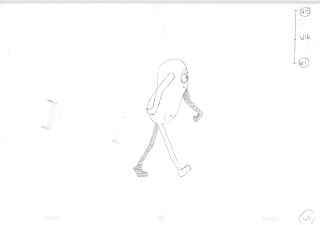
This is a really basic walk cycle, with a simple character (with two legs, two arms). Animated on 2s. (Without inbetweens but if you look in the top right hand courner you'll see a where the inbetweens go) The shaded arm/leg is the one behind.
1.) Contact: This should be the first drawing you draw.
- Both feet touch the ground.
- Arms swing oppsite to the leg
2.) Down: The character should reach the lowest point in this drawinging. This drawing is should placed in between the passing and the contast.
- Body dips down, to its lowest point, the front leg should be taking the weight.
3.) Passing: Middle drawing, should be drawn second.
- The body is going up, the leg is lifted and passing the leading leg, ditto for the arms.
4.) High Point: The character should be reach it's highest point in the walk cycle.
- The body's weight is tipping foreward and the leading leg is moving forewards to catch the body from falling
5.) Contact: The legs and arms have swapped arms. The next three drawings should be the down, passing and up only reversed from the previous drawings.
I'll do a post on the inbetweens later, k? :)
Tuesday, August 31, 2010
Monday, August 23, 2010
Subscribe to:
Comments (Atom)


